What do Lady Gaga, Frida Kahlo, and Ernest Hemingway have in common? Extremely strong personal brands.
Creating a strong and recognizable brand like these artists is a huge endeavor. So, let’s start with a small, but very important step towards a strong personal brand - your business card.
We’ve compiled the seven key components for a memorable and effective business card to ensure the recipient keeps the card and the card keeps you top of mind. Does your business card have:
1. All the Right Details
Business cards supply basic contact information and facilitate art sales!
-
Name - As an artist, your name is your professional brand - make it a prominent feature. Also include the type of artist you are - sculptor, painter, photographer, etc.
-
Email Address - Provide a dedicated email address for your art business so potential buyers can contact you wherever, whenever.
-
URL for Your Work - Your personal website and Artwork Archive Profile - and even your social media channels - allow people to access more of your art. And hopefully find a piece to purchase! Consider a call to action before the url such as “Visit my online portfolio.”
-
Address - If you have a dedicated studio address/P.O. box, then add those to your business card. Some buyers like the option to communicate via mail.
-
Phone Number - Include a phone you will answer. And set up a 24 hour voicemail with studio hours, if you do commissions, where your work is exhibited, and other basic information.
For more on what basic information to include on a business card, check out Business Cards 101 for artists.
2. Images that Impress
Images of your work make you memorable and distinct. High quality images are a must! Be sure it’s your trademark style and easily recognizable as your work. You can even include an image of you and your art. It will allow prospective buyers to put a face to a name - and a name to awesome art! Remember not to overdo it though. You don’t want that awesome art too small or too crowded to do it justice.

A round up of our favorite business cards from the Art Students League of Denver Summer Art Market (clockwise L to R): Jean Caggiano, Jacqueline Webster, Michelle Fisher, and Stephanie Aguilar.
3. A Sensible Size
Goldilocks knows a thing or two about the perfect size. Find that size sweet spot. If it’s too big to fit in a wallet, try smaller. If it’s too small to keep track of, try bigger. Most business cards are 3.50" x 2.0." That being said, feel free to play around with sizes and be unique. Try out square cards (2.56" x 2.56") or mini cards (2.75" x 1.10").
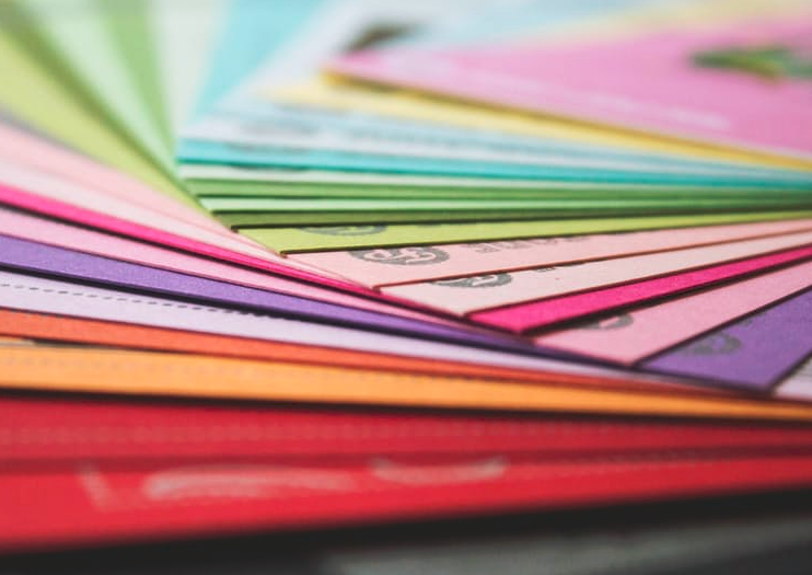
4. The Right Stock
While most cards are paper, paper thin is not your best choice. Try something sturdier that won’t crumple in transit. It will make you stand out from the pack. Many business card manufacturers offer different weight options. Start with 350gsm paper stock as a good standard. Feeling luxe, go for 600gsm.
5. A Subtle Shine
There are two main options here - matte or glossy. It’s a personal preference, but many of the modern cards have been leaning towards matte. Not a boring matte, but a silky matte with just a slight sheen. Gloss can also make it hard for potential buyers to write notes on your card. Notes about your art are a good sign - and could lead to a sale!

6. Easy to Read
You’ve spent days agonizing over what to say - ok a bit dramatic - but you’ve put effort into choosing the words on your card. Don’t forget to make them readable. Font, font size, and color choice all play an important role in readability. Small yellow calligraphy on a white background will make even those with 20 / 20 reach for glasses. Be sure to choose an easy to read font that’s big enough. And work color theory magic.
7. Smart Use of Space
Having a hard time fitting your images and information on a 3.50" x 2.0" rectangle? Consider using both sides. It’s okay to have some blank space too. It allows potential buyers to take notes on the card about their favorite piece or where they met you. Also, the cost of printing on both sides is only slightly more expensive than using one side. Go for it!

This inventive business card by Rob Davenport shows an excellent use of space.
Want more creative ways to stand out from the pack? Check out 7 Fresh Ideas to Make Your Art Marketing Stand Out.