Pantone, the internationally-recognized expert in color, released their 2016 color(s) of the year and they’ve have taken the art world by storm. This is the first year that they have named two colors to predict this year’s trends: Rose Quartz and Serenity. With a focus in effective color communication, Pantone chooses their color of the year as a snapshot of contemporary culture.
The inspiration behind this year’s colors is finding relaxation amidst turbulence. The rose tone reflects compassion and composure, while the cool blues are meant to portray order and peace. The combination holds a larger, cultural significance. “In many parts of the world we are experiencing a gender blur as it relates to fashion, which has in turn impacted color trends throughout all other areas of design,” the Pantone Team says.
The barriers of gendered color association are thinning, and we will see this in design, decor, and art. We are breeding a generation that has less concern about being typecast or judged by color usage, which will inevitably spark new forms of creativity.
Pantone has released a variety of color palettes that include this year’s colors. As you see these colors emerge in the art world, use them to inspire your collection.

Image Credit: Lawrence Lee
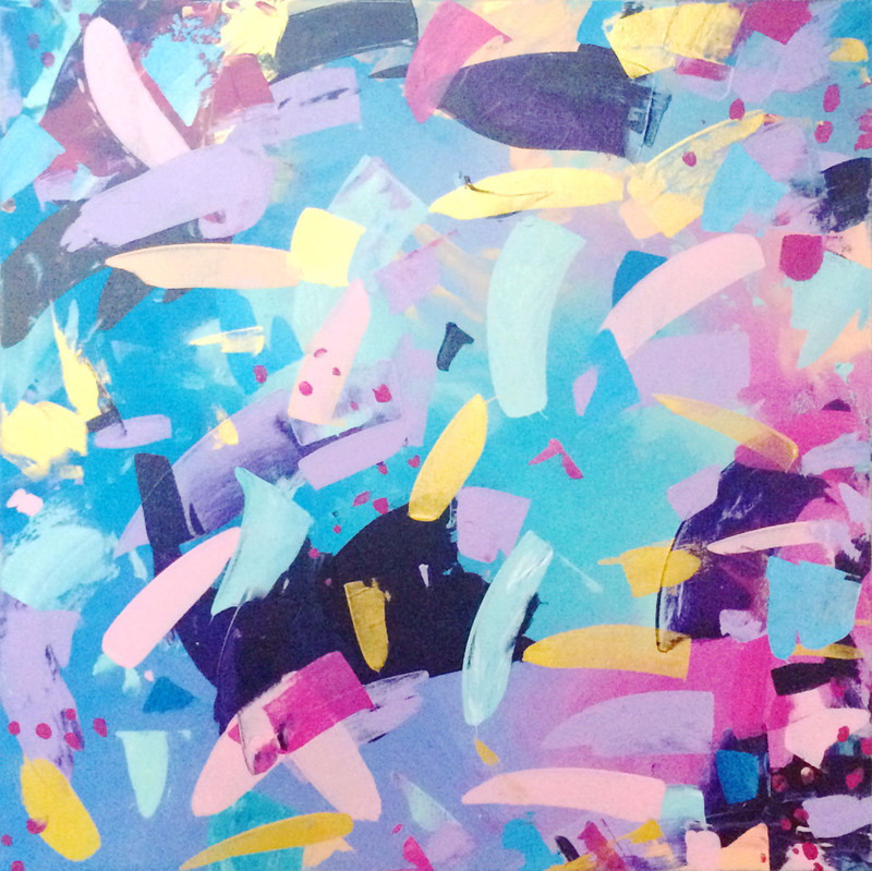

Image Credit: Sarah Jane Brown
We chose the above images because, in our eyes, they reflect this year’s colors. To see Pantone’s images and swatches, click here.