Courtney Cotton
Landrum, SC
Contemporary artist exploring conceptual themes through painting, sculpture, and collage.
Message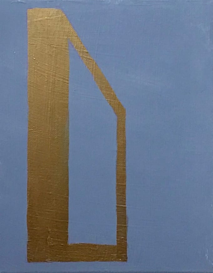
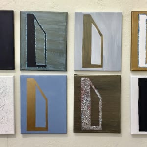
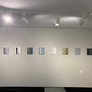
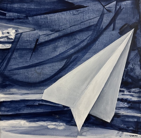
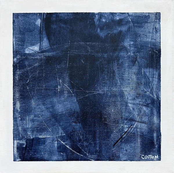
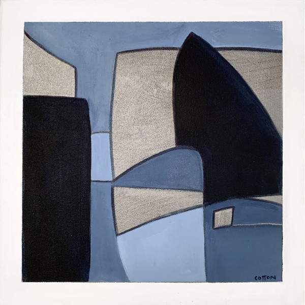
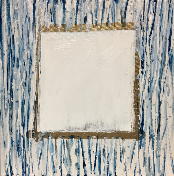
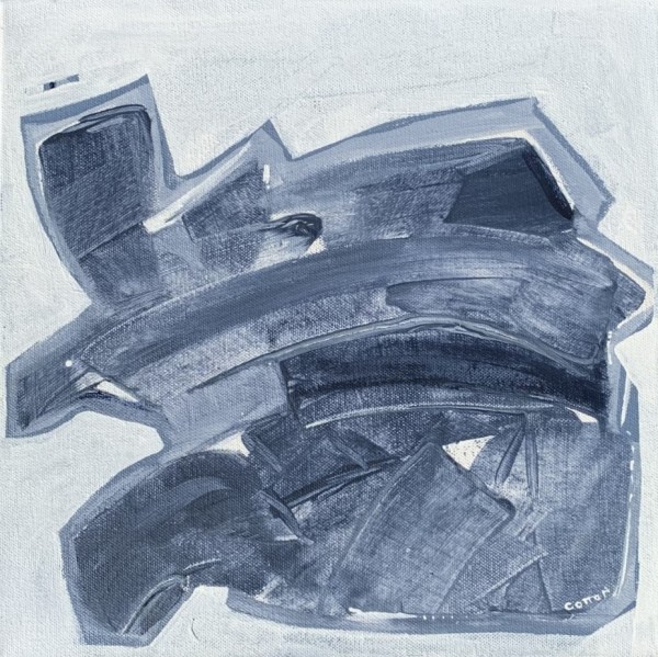
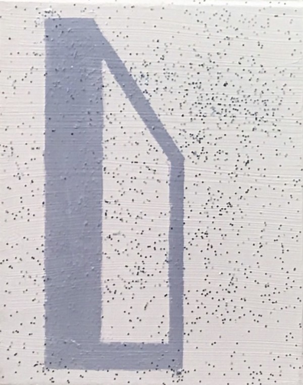
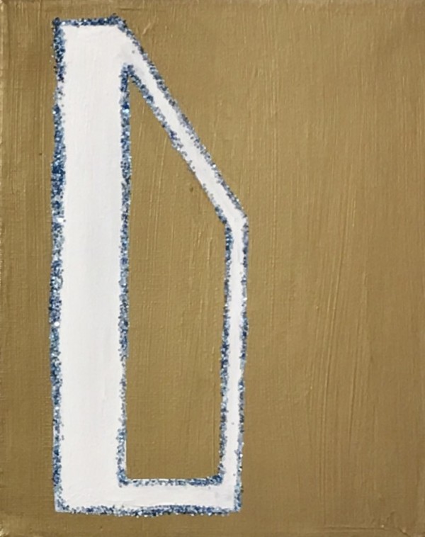
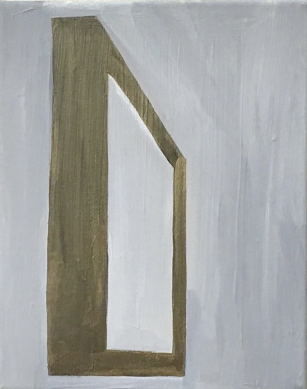
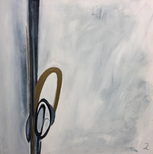
This piece is 1 if 10 ten 10”x8” colorway studies of the same subject matter.
Part of a larger collection “Collection 20” a workshop prompt to create 20 works in one studio day at *Anderson Ranch Summer 2017. The result is a thirty piece multimedia body of work.
At the onset, I was not sure why I selected the palette I did for the series but I would surmise it was to limit color making decision giving me more time to crank out the twenty pieces and to break away from my “typical palette.” I also have had a recent crush on Payne’s Grey so that was my first go to.
In retrospect, I believe the meaning of the palette colors dark blue, gold and white represent place of the artist at creation time. I would say the dark blue or Payne’s gray represents darkness or sadness. Gold represents light, both inner light or self and outer light - universal. The white represents peace and being present. All the variations these colors make represent contrast.
The body of work encompasses painting, sculpture, drawing, collage and video. Materials are wood, cardboard, tape, canvas, paper, trash, magazines, metal scraps, found objects, paint, glitter, string and sharpie.
Copyright © 2017 Courtney Cotton - All Rights Reserved
To see more day to day about my art follow me on Instagram @courtneycottonetal
*In the summer 2017 I was honored to attend an advanced painting and dialogue workshop at Anderson Ranch Arts Center. Under the direction of artist and painting chair [California College of the Arts – San Francisco] Linda Geary and Fulbright Scholar intern Veda Sun myself and 7 other amazing artists spent 12 long days together. The collective energy of our group was evident and breakthroughs as well as friendships were made.
- Subject Matter: Conceptual - graphic design colorway concept
- Current Location: Courtney Cotton art studio - 3944 S. Broadway Englewood, CO 80113 (google map)
- Collections: Anderson Ranch
Other Work From Courtney Cotton