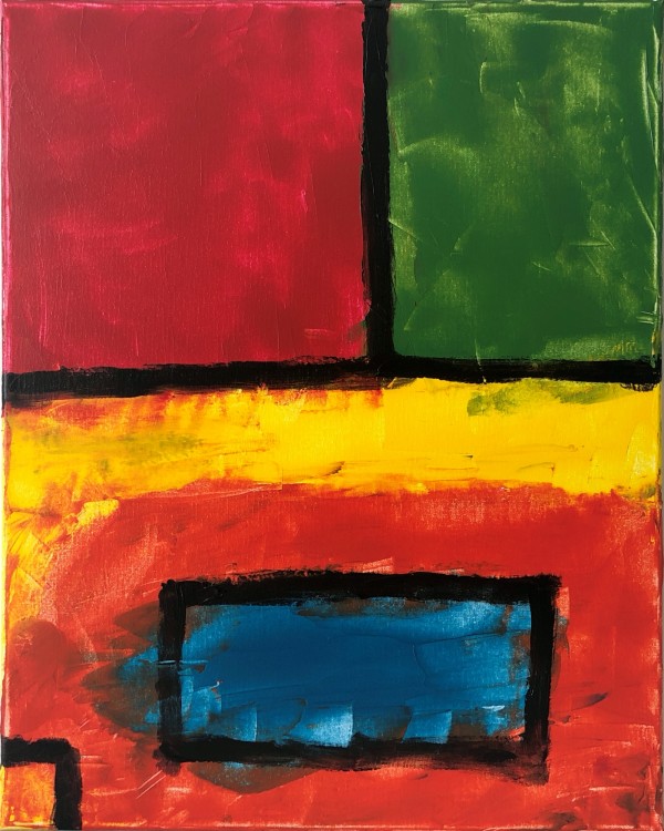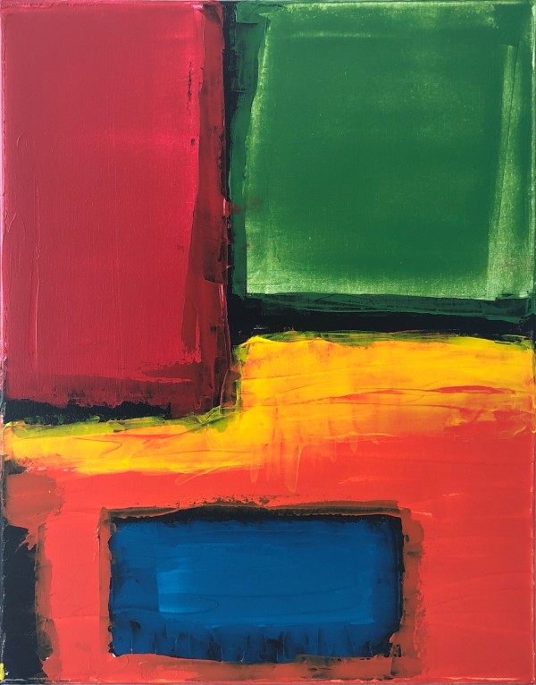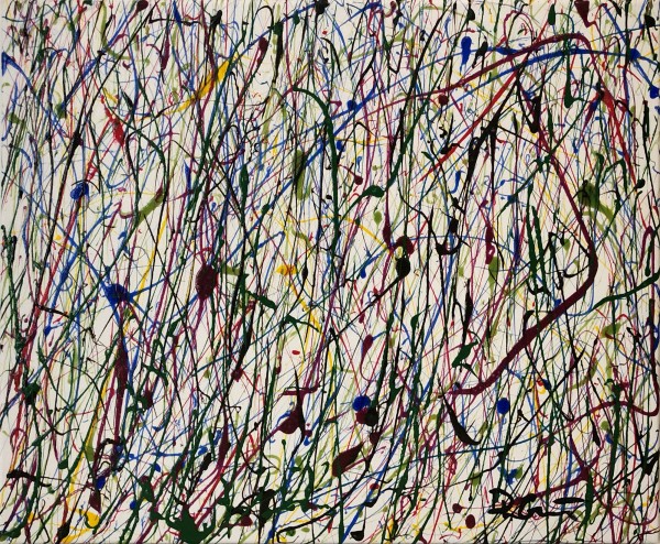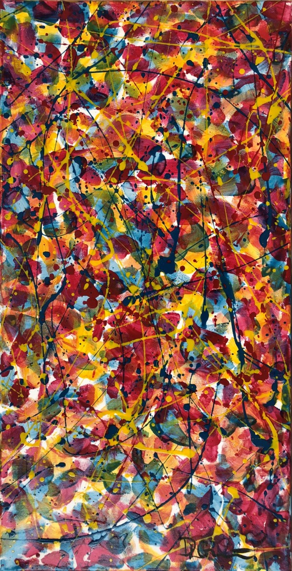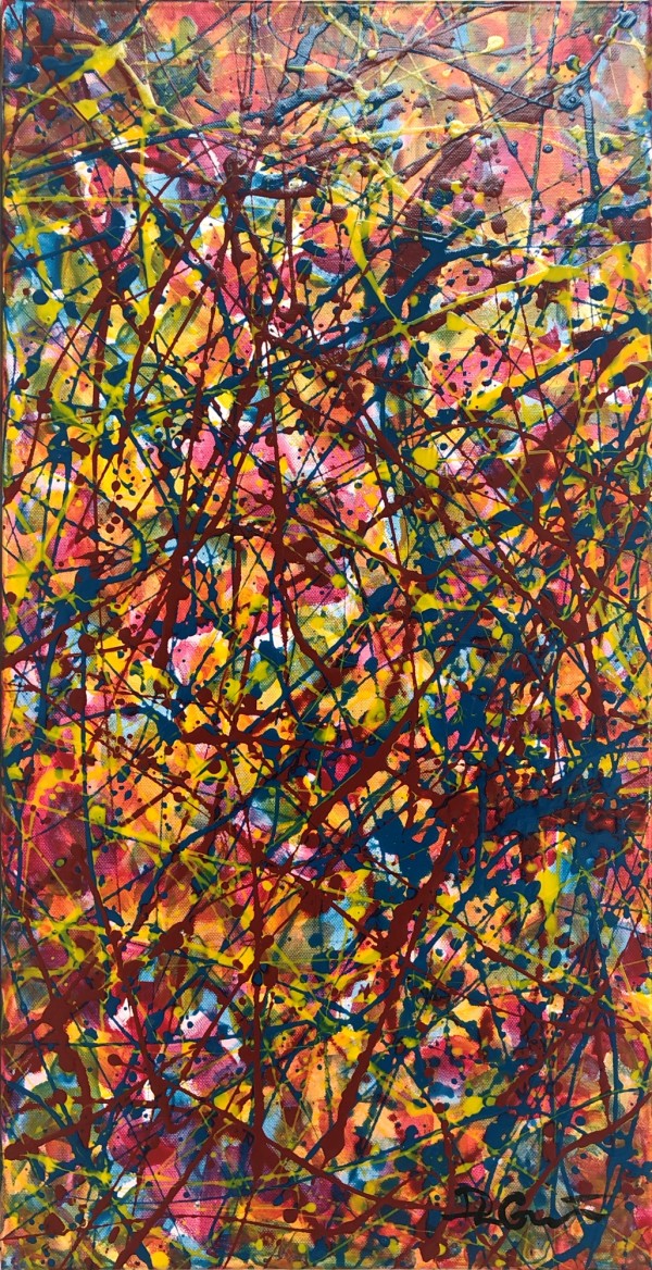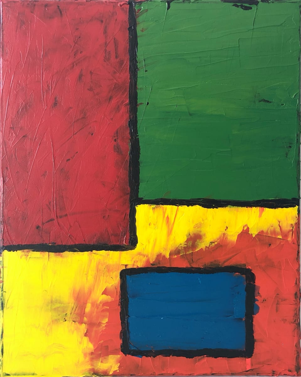
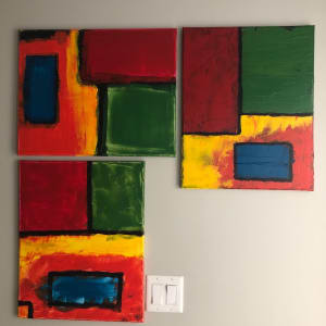
Study of color fields and color theory. This is a set of 3. As you can see I don’t like clean lines. I had a hard time not doing a drip over the whole thing. The color relationships are purposefully placed. For example the blue on a field of orange. A complimentary hue (orange) surrounding it’s primary ( blue) will make the primary look more vibrant. The rest I’ll leave for you to find. In a departure from signing the front of my work, this set is signed on the back so each painting can be hung in any orientation.
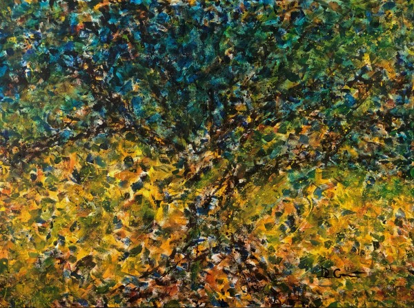
- Subject Matter: Abstract
- Collections: Studies Collection