Color is one of the most powerful elements in art quilting, setting the mood, creating movement, and drawing the viewer’s eye to key focal points. Whether I’m designing a bold, vibrant quilt or a soft, subtle composition, colour is always at the forefront of my creative process. Here’s how I approach colour in my art quilts.
1. How Colour Sets the Mood
Colours evoke emotions and influence the atmosphere of a space. The right palette can transform a quilt from energising to calming, nostalgic to modern.
- Warm tones (reds, oranges, yellows): Convey warmth, passion, and energy.
- Cool tones (blues, greens, purples): Create a sense of tranquility and depth.
- Neutrals (whites, greys, browns): Provide balance and sophistication.
2. Finding Inspiration for Colour Combinations
I draw inspiration for my color palettes from various sources, including:
- Nature: Sunsets, ocean waves, autumn leaves, and landscapes offer endless ideas.
- Art and Design: Studying paintings, textiles, and graphic design helps me discover fresh color pairings.
- Personal Photography: Capturing colors in everyday life helps me build a unique palette for each quilt.
3. Playing with Contrast and Harmony
The relationship between colours affects how a quilt is perceived. I carefully balance contrast and harmony to enhance depth and movement.
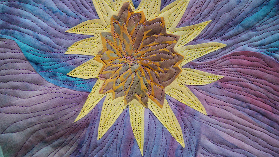
- Complementary Colours: Opposing hues (such as blue and orange) create high contrast and dynamic energy.
- Analogous Colors: Colors close to each other on the color wheel (like blues and purples) produce a cohesive, harmonious feel.
- Monochromatic Schemes: Different shades of a single color add subtle elegance and depth.
4. How I Use Gradients and Layering
Color transitions can create smooth visual flow and add depth to a piece.
- Hand-dyed and gradient fabrics allow me to seamlessly blend hues.
- Layering sheer fabrics helps create a sense of translucency and dimension.
- Overlapping stitched textures reinforce color shifts and highlights.
5. The Impact of Light on Color Choices
Fabric colors can look different under various lighting conditions. I always test my fabric selections in natural and artificial light to ensure consistency in the final piece.
- Bright lighting enhances vivid hues and sharp contrast.
- Soft lighting brings out subtle variations and warmth.
- Directional lighting can create shadows that affect color perception.
6. The Emotional Connection to Color
Every quilt I create tells a story, and color plays a huge role in expressing its meaning.
- Personal color preferences guide my artistic intuition.
- Cultural and symbolic meanings influence how a quilt is interpreted.
- Custom commissions allow me to incorporate colors that have personal significance for a client.
Final Thoughts
Color is a fundamental part of my art quilting process, shaping the way a piece is experienced and appreciated. Whether through bold contrasts or subtle gradients, I strive to create art quilts that resonate visually and emotionally.
Some of my artwork can be created in a different color scheme but the process is not always available due to time constraints and the availability of various fabrics.