Christine Ruksenas-Burton
Northern Virginia
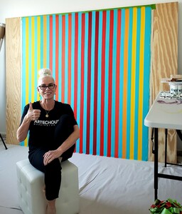
My hard edge color field linear abstractions, are conversations of color, designed to evoke pure emotion. I truly believe, hues change moods.
Message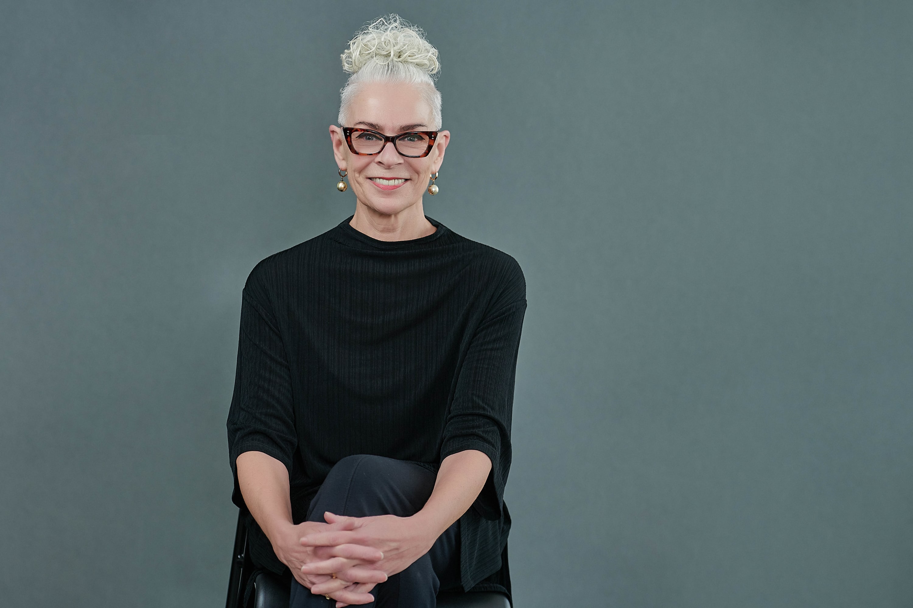
Christine Ruksenas-Burton’s body of work is composed of hard edge color field linear abstractions, a style rooted in a movement that began in New York City in the 1940s pioneered by Mark Rothko, Barnett Newman, Ellsworth Kelly and Clyfford Still. Growing up in Australia, she enjoyed a playground of raw beauty and rich colors in each season. Her paintings are conversations of colors inspired by her homeland as well as modern art, minimalism, modernist architecture, and design. She uses acrylic paints for her work after meticulously taping each canvas. Christine’s work has been compared to that of Gene Davis; however, her philosophy is rooted in numerology and color therapy. Christine has been commissioned by corporate and private collectors, exhibited at corporate and community sponsored exhibitions across the Washington, D.C. metropolitan area, Art Expo NY, Red Dot Art Fair at Art Basel Miami Art Week, Santa Fe Art Expo, Dallas Art Expo, she has private collectors in Australia, Washington DC, New York City, Orlando FL, & Gallery representation in Miami, Florida. She studied and worked in Arts Administration, Development, Fundraising and Promotions Management, freelance publicist, is a photographer & biographer.
Statement
I paint hard edge color field linear abstractions, a style rooted in a movement that began in New York City in the 1940s pioneered by Mark Rothko, Ellsworth Kelly, Barnett Newman, and Clyfford Still. Their work explored a departure from illustration to sensory connections with primal emotions by exploiting the expressive power of color. Growing up in Australia, I enjoyed a playground of raw beauty and rich colors in each season. My work is influenced by those rich colors that excite my visual senses and emotions: the spectrum of greens in the foliage, vivid pinks and orange summer sunsets, deep blue to aqua waters, light blue skies, rust earth of the outback, and bright red, violet, mauve, and yellow flowers and fruits.
My paintings are conversations of colors inspired by my homeland as well as modern art, minimalism, modernist architecture, and design. Each canvas is a rhythm of hues and tones in precisely defined lanes of like and juxtaposed colors repeated in values of one, two, and three. Every color is a sentence in a conversation that flows from beginning to end across the canvas. A sense of quietude is present, free of distraction, to arouse a connection between our visual senses and pure emotions.
I use acrylic paints for my work because they’re easy to blend and dry very quickly. After meticulously taping a canvas or panel board, I blend paints to create one, two, or three lanes of a hue, responding to my internal conversations about the art itself and other elements of life, which determine the colors. Occasionally I apply epoxy resin for a high gloss finish.
My work has been compared to that of Gene Davis, one of six founders of the iconic Washington Color School in the 1950s. Ironically, I had never heard of him before 2018, but the comparison was made while I was showing at an art fair in Washington, D.C. While our work may look similar, our philosophies are quite different. My methodology is rooted in numerology and color therapy and guided by the repetition of a certain number of colors and hues to form a rhythm across the canvas. I believe in the power of color and it's ability to assist the body heal itself.
We all have a subconscious relationship with color, however, we are conditioned to respond to colors in expected ways, like associating red with danger. I want people to explore feeling colors before judging them. My paintings provide an opportunity to do so.