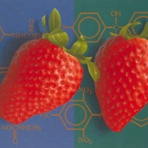
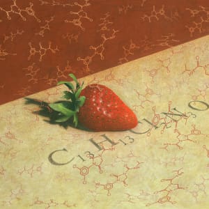
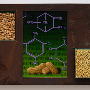
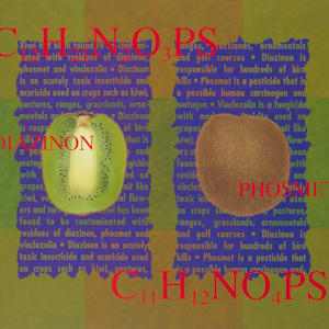
Chemical Still-Life
A series of paintings portraying food contamination by chemicals found within each produce/food depicted. These images deal with food production in an industrial society and the price we pay as consumers for our craving for blemish free produce. This all-year perfection comes at the expense of taste and, along with possible long-term consequences to our health, also affects our overall environment due to agricultural pollution.
In still life painting, the subject matter is rarely important for its own sake; rather, it most often serves as a showcase for the artist’s compositional skill and ability to render detail and texture. My approach is to reverse the priority, by placing more emphasis on the subject matter rather than compositional skills.
Each painting presents the viewer with a secret warning, a riddle of sorts, not meant to be understood by everyone.
Most of us know about pesticides, but few of us really know how much we are exposed to and how dangerous some can be.
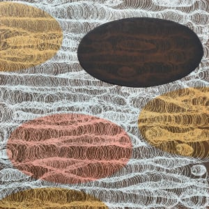
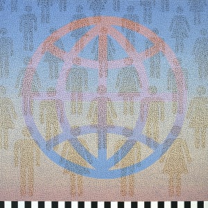
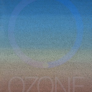
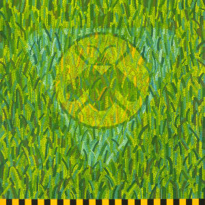
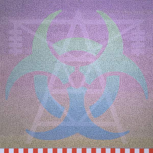
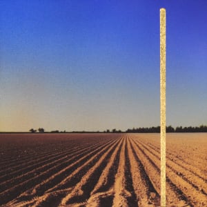
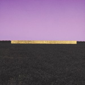
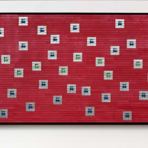
Ecoworks
A series of paintings featuring an environmental theme and a personal interpretation of warning signs.
Each composition is made by applying acrylic paint to a surface with the aid of a small stick - a technique utilized by the Aborigines to create their dream paintings.
My personal variation on this technique involves applying each dot of paint, (representing a molecule), next to another, to create a mosaic pattern. By applying the paint dots close to each other, but without touching, creates tension and vibrancy. The empty space between the paint dots represents the energy that holds matter together.
The end result are paintings where the symbols or the type appear as ghost images filtered through a molecular pattern.
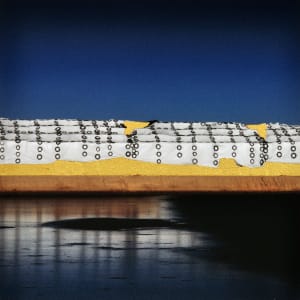
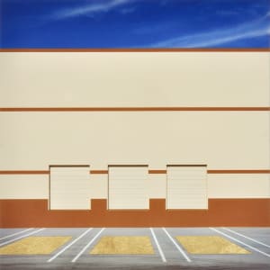
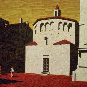
Golden State
A series of mixed media paintings featuring the landscapes of the San Joaquin Valley of California.
The San Joaquin Valley, with its fertile lands and easy water policies, represent a sort of Golden State – a state of abundance and wealth; now a bit tarnished by too much abusive agriculture practices and urbanization.
This body of work is created by mixing contrasting techniques - such as digitally manipulated photography, gold leafing, air brushing and painting.
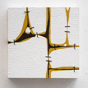
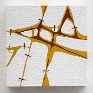
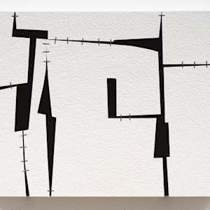
Holding On
"Holding On" is a new series of mixed-media works exploring the themes of fragmentation and the use of fasteners to hold visual elements together. With the aid of staples, wire, bolts, and rope, these broken works are vulnerable, but have an imperfect beauty that impart character and uniqueness.
In ancient times artisans used to save pottery by stapling the broken pieces together with rivets (a craft known as Ju Ci in China and Kintsugi in Japan). I thought of this mending as a perfect metaphor to depict entropy (a concept most commonly associated with a state of disorder, randomness, or uncertainty). In our youth our lives are geared towards accumulating, building and expending. As we we age, we start to loose relationships, slow down and try to hold on to what we have. In many ways, these works are an abstract reminder of what it means to be a human being - all of us have physical imperfections and emotional scars that makes us who we are. Part of aging is trying to hold on to what we know, love and cherish as long as we can.
In ancient times artisans used to save pottery by stapling the broken pieces together with rivets (a craft known as Ju Ci in China and Kintsugi in Japan). I thought of this mending as a perfect metaphor to depict entropy (a concept most commonly associated with a state of disorder, randomness, or uncertainty). In our youth our lives are geared towards accumulating, building and expending. As we we age, we start to loose relationships, slow down and try to hold on to what we have. In many ways, these works are an abstract reminder of what it means to be a human being - all of us have physical imperfections and emotional scars that makes us who we are. Part of aging is trying to hold on to what we know, love and cherish as long as we can.
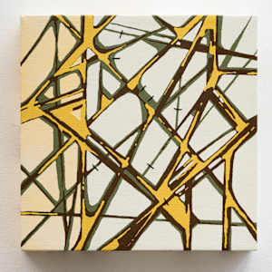
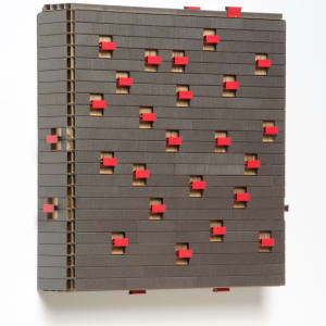
Staples
A series of wall-mounted assemblages made of unusual materials found at office supplies and hardware stores.

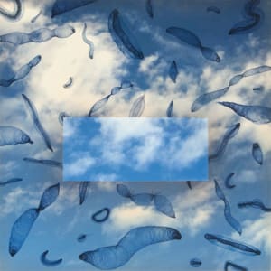
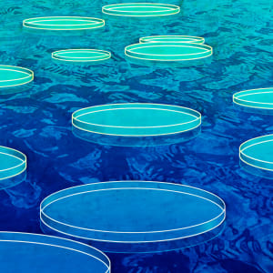
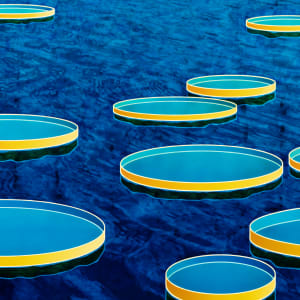
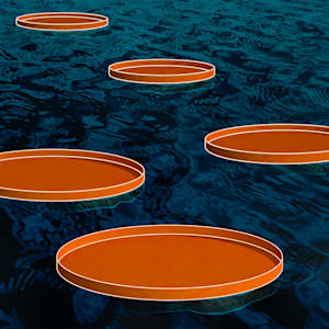
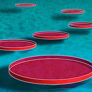
Waterlilies
The “Waterlilies” series is my contemporary homage to Claude Monet’s iconic series and represents my abstract interpretation of the emotional state we all suffered through the pandemic. These mixed media paintings, attempt to capture the sense of solitude and the fragility of our social connections that defined those uncertain years.
During the pandemic we found ourselves thrust into isolation, confined to our homes and limited to interactions through digital screens. The giant colorful ovals represent the Victoria Amazonica water lily pads - the vibrant colors and textured layers illustrate the feeling between light and darkness, the safety and the unstable.
Like these lilies, we all became passengers floating in a serene, yet transient and unsteady environment, interconnected yet isolated. We all experienced the fear of the unknown, the anxiety about our loved one’s health and safety, and the overarching sense of loss for the normalcy we once took for granted.
Communication became both a lifeline and a paradox. While separated physically into “family pods”, the technology provided us a two-dimensional window to socialize with the rest of the world. Video calls, messages, and social media became tools for connection. Like floating on lily pads, we lived simultaneously close and yet apart; able to voice our fears and triumphs but discouraged to touch or embrace.
I purposely created this series to be a positive affirmation of the human spirit. Just as the water lilies must adapt to their surroundings and flourish, we had to learn to find beauty in our confinement, crafting new routines, reinventing ourselves through new hobbies and talents, and discovering our most inner selves again.
By revisiting Monet’s legacy through a contemporary lens, I hope to evoke a sense of empathy and shared humanity, reminding us that even in isolation, we are never truly alone. We may float separately, but together we can still be resilient and flourish.
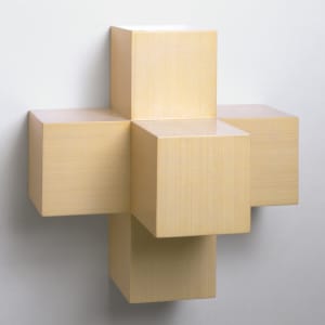
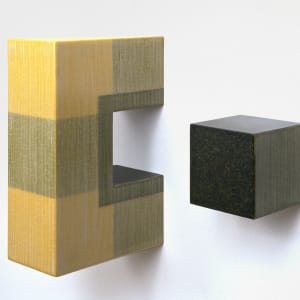
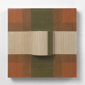
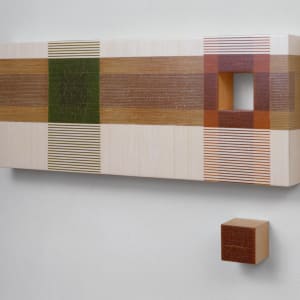
Wheatfields & Wheatboxes
A series of wall-mounted sculptures made of different kinds of spaghetti and noodles. These minimal compositions are an abstract interpretation of food containers and the disproportionate role they have in modern processed food distribution.
Each painted wood structure is covered with a very thin layer of dry spaghetti, glued strand by strand, one placed next to each other, row after row, to create a large three-dimensional linear mosaic. Some of the sculptures are designed as multiple units, created to incorporate the empty wall space between each section into an overall composition.
The variations of colors arise from the different ingredients used in the manufacture of the pasta itself. Spinach spaghetti are green, chili pepper spaghetti are red, and black spaghetti owe their color to squid ink.
Some incorporate the use of intersecting structures made of transparent Plexiglas. These dissecting plastic elements are abstract reminders of the spy windows used by many spaghetti manufacturers to exhibit the pasta within each carton container.
The nature of the pasta in these works is drastically changed to a point that it loses its recognizable shape, texture and use. In a metaphorical sense, the box containing the spaghetti is thus reborn as a box constructed of spaghetti. The packaging becomes part of the buying experience – food becomes art and entertainment.