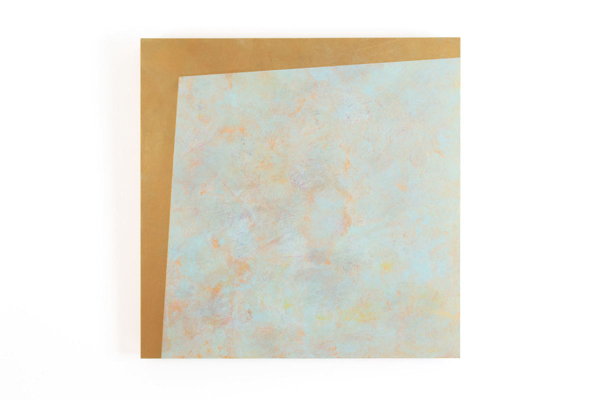
I titled this painting after watching Waldemar Januszczak’s three-part documentary “Rococo: Before Bedtime” It’s still available on Amazon Prime Video if you want to check it out (and with a title like that, how can you not be intrigued?) Credit where credit is due: I hated Rococo art before I saw this, but his documentary helped me to gain a new appreciation for it. I thought Rococo artworks were superficial, that Rococo design was visually cacophonous, that it was the worst kind of kitsch and/or ostentatious for the sake of being ostentatious. And a lot of it is. But I was always drawn to Fragonard’s “The Swing,” even almost as an abject attraction, like the phosphorescent bloodbath left on my table when I mistook a firefly (lightning bug) for a spider one time. It’s the best, worst painting ever made. The subject—a man hides in the bushes to look up a girls dress while an old man, who is either unwittingly involved or VERY wittingly involved in their foreplay, pushes the girl on a swing—is so stupid, so devoid of content (are we the old man? Are we some forth spectator? Is this some kind of early, super-soft core pornography? Who cares?) but the painting is executed so well that I just want to keep looking at it. The brushstrokes are expressive, the asymmetrical composition is continually engaging, the quality of the golden light coming through the trees is almost tangibly warm. It’s beautiful. And that, in a nutshell, is Rococo. Or maybe I should say “in a seashell,” because the term “Rococo” is a combination of the words “Rocaille” (a French term associated decorating with seashells) and the Portuguese “Barocco” (misshapen pearl), which is also where the “Baroque” gets it’s name. But beyond those aquatic themes, Rococo art also has a fluffy, atmospheric, kitschy aspect to it that reminds me of cotton candy, hence, “Rococotton Candy.” Abstract art is like a horoscope: we see what we want to see in it. In this piece, I see some qualities that fit in with Rococo art, such the asymmetrical composition and the gold, seafoam green and other soft pastels, and I like fun titles because I want the work to feel approachable...and here we are!
“Rococo” is a combination of the words “Rocaille” (a French term associated decorating with seashells) and the Portuguese “Barocco”--misshapen pearl--which, incidentally, is also where the “Baroque” gets its name. Beyond the aquatic themes of seashells and pearls, Rococo art also has a fluffy, atmospheric, kitschy aspect to it that reminds me of cotton candy. I see the same qualities in this work as well, hence the playful title for this work: “Rococotton Candy.”
- Subject Matter: Geometric abstract


