BarbaraHouston ArtStudio
Bonavista, NL
Landscape + materiality have a profound influence on Houston's creative practice where art + design intersect. Landscapes of people + place.
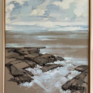
MessageLINEN
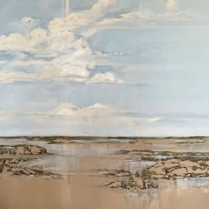
Working on raw, certified authentic Belgian linen (LIBECO, since 1858), materiality becomes the unifying force of the composition. The inherent tone of the linen functions as a painted colour, structuring a positive–negative composition in which unpainted areas generate tension between representational specificity and the open space of the canvas. These absences invite the viewer to remember and to see, rather than to simply observe.
Rooted in LIBECO’s sustainable lineage, the work offers ethereal depictions of landscape that expand the tradition of landscape painting through process and material intelligence. Reminiscent of aquarelle, colour field painting, and staining practices, Houston’s paintings operate parallel to the viewer’s memory—colour and line asserting presence while negative space draws attention to the textures of the warp and weft.
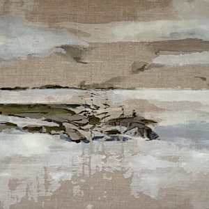
*VERSO is unique process to Houston where diluted pigmented gesso is pressed through raw linen, with the artist working on both sides of the surface. The resulting image is a distillation of form, colour, and surface, its subtlety amplified by the unified, inherent colour of the linen itself.
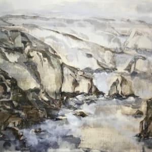

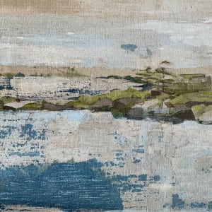
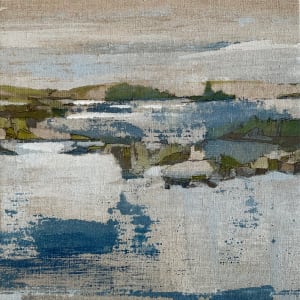
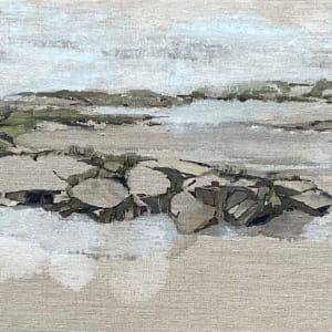
VERSO
‘Verso’ series is a group of paintings on raw Belgian linen with acrylic, archival ink + Japanese graphite.
Integral to Houston’s work is the landscape of people, place, community and belonging. Emerging in the marks, pigment and the raw material, the ‘Verso’ collection of paintings captures places in and around the Bonavista peninsula. Inviting the viewer to look closely and draw on their own memories to establish ‘place’.
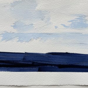
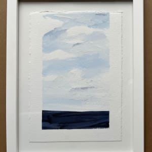
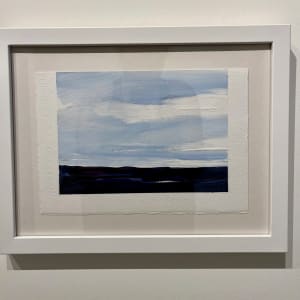
Captured first in small studies, sketches and drawings, the canvas is edited and painted firstly in the reverse. Once the reverse layers are established, the linen is removed and restretched in the direct orientation. A second painting is done on the front canvas enhancing the layers and pigments that were initially created by pressing the paint through the warp and weft of the Belgian linen.
The outcome is an ethereal, dream like haze of very familiar landmarks.
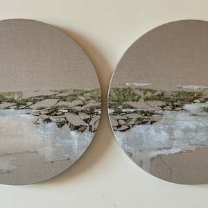
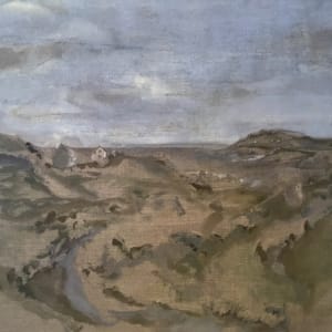
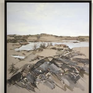
COMPASS
COMPASS
Working from the tradition of landscape painting and using contemporary materiality as a starting point, I am recording places found along the Bonavista Peninsula presenting them as grand panoramas. Adjusting perspective, relying on the material (Belgian linen) and the familiarity of the landscape itself, the inland ponds are linked by a datum line and the relationship to each other and the cardinal points referenced to connect the individual paintings and envelop the viewer. An invitation to the viewer to see the colours of the sky, the water the land and to recognize and be reminded of stories of the sustaining nature of the landscape as it relates to belonging and community.
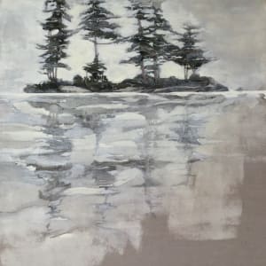
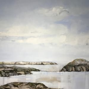
LINEN+CANVAS
Houston conceptually stitches together white gessoed canvas (sky) and the warm tones of Belgian linen (ground). Pulled taut, the stitches and selvage edge become a visual texture—echoing the distant horizon line of black spruce and tamarack imagined far away. The placement of the horizon initiates the composition; once assembled, the canvas is stretched and prepared for painting. Clear gesso is applied to stabilize both materials while allowing their inherent qualities to remain visible.
The “painted color” of the canvas meets the linen to form a dialogue of positive and negative space. Areas left unpainted create a deliberate tension between representational specificity and open visual fields, inviting the viewer to remember, project, and see.
PAPER
Working across Tyvek, Yupo, and Arches paper, the paintings employ positive and negative space as active elements, where suggestion and restraint allow imagery to remain distilled rather than descriptive. The material qualities of each surface—synthetic, translucent, and absorbent—shape how forms emerge and recede, adding meaning and purpose to the work. Through this interplay of materiality and absence, the imagery remains open, inviting perception rather than prescribing it.

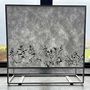
WOOD
Torrefied maple and cradled birch panels are engagedirectly with the natural grain of the wood to draw out images embedded within the material itself. Rather than imposing representation, the process extracts forms suggestive of the Newfoundland landscape, allowing the wood to function as both surface and painted color. This approach foregrounds the inherent tonalities and rhythms of the material, resulting in a lyrical interpretation of place—one that balances restraint and expression, presence and evocation.