
When it comes to what color of frame will enhance your art choices be sure to also consider how it will pull your home décor and wall color together without being overly matchy, matchy.
The experts at Framebridge.com can help, even if you only read these five expert tips, on how to ensure your frames complement your interior color palette, but I think you’ll want to read more of what they have to say! I know I do……
1. Check your undertones.

Warm floral walls are perfectly complemented by a warm, rose gold frame in a sleek profile paired with a bright white mat. Image by @centered_by_design .
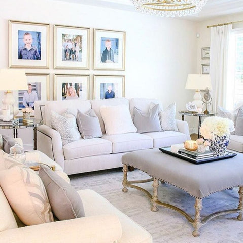
A wide profile champagne silver frame ties @randigarrettdesign's gallery wall to the cool grays and pinks of this interior while balancing the warm cream wall color.
Almost all paint colors are created by mixing two or more colors together, meaning that every shade out there has a mass tone (the color you register the paint as, like beige, taupe, blue, you get it) and an undertone. It’s these undertones that hold the key to a cohesive interior and identifying them will help you choose frames that complement your color palette.
So how do you identify the undertone of your paint color? Compare your paint color to its closest “true color” relative. For example, if your walls are an off-white or cream, use a paint swatch or color wheel to compare it to red, yellow, and blue-based creams. Your closest match will indicate your undertones. Many colors that are often considered cool (like gray and white) actually have warm bases. Testing it against a known swatch is the easiest way determine what undertones you’re working with.
So, now that you know your undertones, you can choose your frames. As a rule of thumb, we typically pair silver frames with cool undertones and gold frames with warm undertones. For example, a cool pale blue will look lovely with silver frames in a range of tones (from champagne antiqued frames to sleek true silver frames). Meanwhile, any room with a warm undertone will look amazing with gold frames. Think grey walls with a warm green base and antiqued gold frames, or a bright green interior with a bright, orange gold. (Pst… we have a guide to picking the perfect gold frame for your art, and many of the color suggestions apply equally well to walls! Take a peek.)
2. White and black are the new neutrals.
Simple black and white frames are endlessly versatile. They work with all interior styles, wall colors, and art colors. It’s like magic. That said, depending on the look you’re after, you might have a preference.
For example, we love pairing a sleek white frame and white mat with a bright white wall. It makes the art the true focus of the interior, the frames adding sophisticated dimension and subtle texture. A similar effect can be achieved with black frames on dark walls. For this look, you can opt for a white mat, dark mat, or one of our favorite modern looks: no mat at all. Some designers warn to stay away from black frames on navy walls. We respectfully disagree. Black and navy is tres chic, and instantly gives your walls just the right amount of edge.

3. Match your whites.
If you pair a white frame with a white wall and it doesn’t look quite right, it’s because the undertones of the whites aren’t aligned. Here’s the secret, if you have an off-white or cream wall, a bright white frame will look too stark against it. Stay away from super sleek white poster frames, and opt instead for a slightly distressed white frame like our Montauk or Monterey frames.
Similarly, make sure your mat color works with both the frame and your walls. For example, if you opt for a bright white frame (hi, Irvine, Irvine Slim, and Palermo)to complement a true white wall, also choose a white mat. When you choose “white mat” for your order, our expert designers will actually handpick the perfect shade of white to complement your art and the frame. Same goes for off-white mats.

4. Go beyond the walls.
While wall color is definitely important (cue this entire article), don’t underestimate how the colors and tones of other design elements may impact your overall interior palette.
Think about your crown and base moulding, any tile backsplash or floors, the tone of wood floors and cabinets, and the colors of your countertops and even furniture!
All these elements can draw out the undertones of your wall color, especially ones that are not immediately apparent.
We’re seeing an overall trend back toward warm neutrals for most design elements. For several years, we noticed lots of cool grays and whites, but now the trends are shifting back to true greens, gray greens, and more yellow based colors.
That means your interior is probably very flexible when it comes to picking the right frame. If you have a warm neutral toned house, you can use the whole gamut of gold frames, champagne toned silver frames (like Newport or Bowery), antique silver frames, unfinished wood frames in a variety of materials (from ash to walnut), black frames, sleek or distressed white frames - basically whatever you want.

5. Don’t worry about matching your art to your walls.
Some people might spend ages looking for the perfect art piece for a specific spot in their home, like the perfect blue-toned abstract art print for the guest bedroom. That’s a perfectly good way to approach decorating, but we suggest always choosing art you really love, even if it doesn’t “match” the rest of your interior style because (hint hint) the framing can bridge the gap between art and wall. A frame with the right color undertones can tie together a wall, and the whole room. It’s kind of magical.
